Here’s another short-and-sweet post!
The previous post showed you how to create a container 📦 for tables in your Quarto presentation1. Here, you’ll learn a few more tricks to style a table.
Disclaimer: Don’t take any of these changes as design recommendations; I clearly know nothing about design 🙃. Just take them as examples of how much you can do on your own to customize a presentation.
Improve The Container
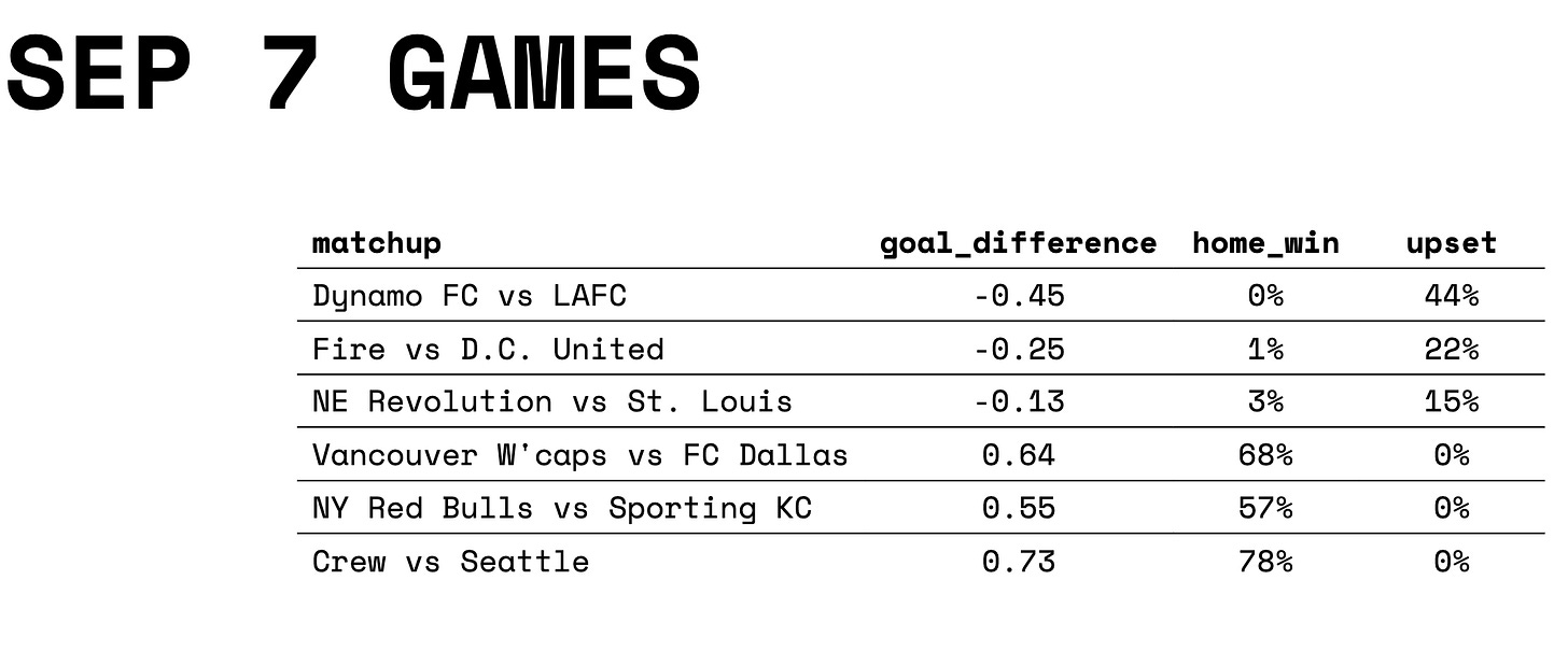
In the previous post, I showed you how creating a container named table-grid could help you control the fonts and position of a table inside a Quarto slide. The table looked like this:
Well, one of the great things about a CSS class (aka your container) is that you can control all sorts of design elements inside it. So, all I need to do to improve table-grid is add a few more lines:
.table-grid {
  font-family: Space Mono;
  font-size: 16pt;
  position: relative;
  top: 40px;
  left: 40px;
  height: 400px;
  align-content: center;
  background-color: #eeeeee;
  border-radius: 25px;
}
heightincreases the height of the container (to cover a larger area in the slide).align-contentmoves the table to the center of the container.background-colorgives the container a light background color to help with readability.border-radiusrounds the corners of the container to “soften” its shape.
Now, the table looks like this:
Keep Experimenting
Again, I’m not a designer, so feel free to criticize how the table looks. My only goal was to show you a few more ways to style a table in your Quarto presentation. What’s really cool about experimenting with these design elements is that you can learn about all sorts of awesome tricks to present data and communicate findings. There are many other elements we could add to table-grid to make the table more user friendly.
Over time, you are going to find the right combination between the design elements you add inside the code chunk (through R, Python, etc.) and outside the chunk (through Sass ). If you wanted to highlight cells or change the formatting of specific numbers, that’s something you can handle inside the code chunk. I’m an R user and I currently use the {kableExtra} package to do this sort of thing, but you can use many other packages and programming languages to create a table in Quarto. Now, if you wanted to improve the table’s size, position, background, etc., then you want to experiment with your Sass custom template file.
Was this post useful? Let me know in the comments and share it with anyone who’s getting started with Quarto.
Coming up in this series: styling plots, printing to PDF, and much more!
The table in this example shows ⚽️ MLS match predictions. I’m playing with different models to predict the goal difference in each match. On this table, a positive goal difference means the home team is expected to win. The upset column is the probability that the away team wins the match. Do you want to learn more about this model and its predictions? Let me know in the comments!


